

Brand theory: Choosing your Substack logo font
Get out of your head, into your heart, and pick the one that feels like you


What we’re doing here Selecting your logo font Finding a font that captures the energy of your world, and understanding how to pair it with a secondary font if needed.
✓ Already have your font chosen and applied? Move on to next steps.
✗ Still going in circles? Read this, open your Substack World Starter template, try a few from the curated selection, and pick the one that feels right.
You’ll need: your Substack World Starter Template in Canva. A cup of tea.
Just landed here and ready to shape your Substack world? I built an entire second Substack from scratch, and documented the entire process just for you. START HERE. Subscribe and let’s do this together, step-by-step.
This is the part where people disappear for three weeks.
You open Canva, you scroll fonts or templates for a while, everything starts to blur, nothing feels quite right, and suddenly you’re questioning your entire brand identity and wondering if you should just start over.
I’m not letting that happen to you.
Here’s the truth: there is no perfect font.
There is only the font that captures the feeling. The one that opens the door to the right people and tells them, before they’ve read a single word, that they’re in the right place.
That’s it. That’s the whole brief.
So let’s make this simple.
Fonts have personalities. Just like people.
The wrong font will give entirely the wrong impression of what you’re building. A font that feels clinical in a space meant to feel warm. A font that feels frivolous in a space meant to feel grounding. A font that whispers when your world shouts, or shouts when your world whispers.
The right font does something quieter and more powerful, it makes your person feel recognised before they’ve consciously registered why.
So before we talk about types and pairings, go back to your mood board. Go back to the feeling you identified. Hold that frequency in your body. That’s your compass for everything that follows.
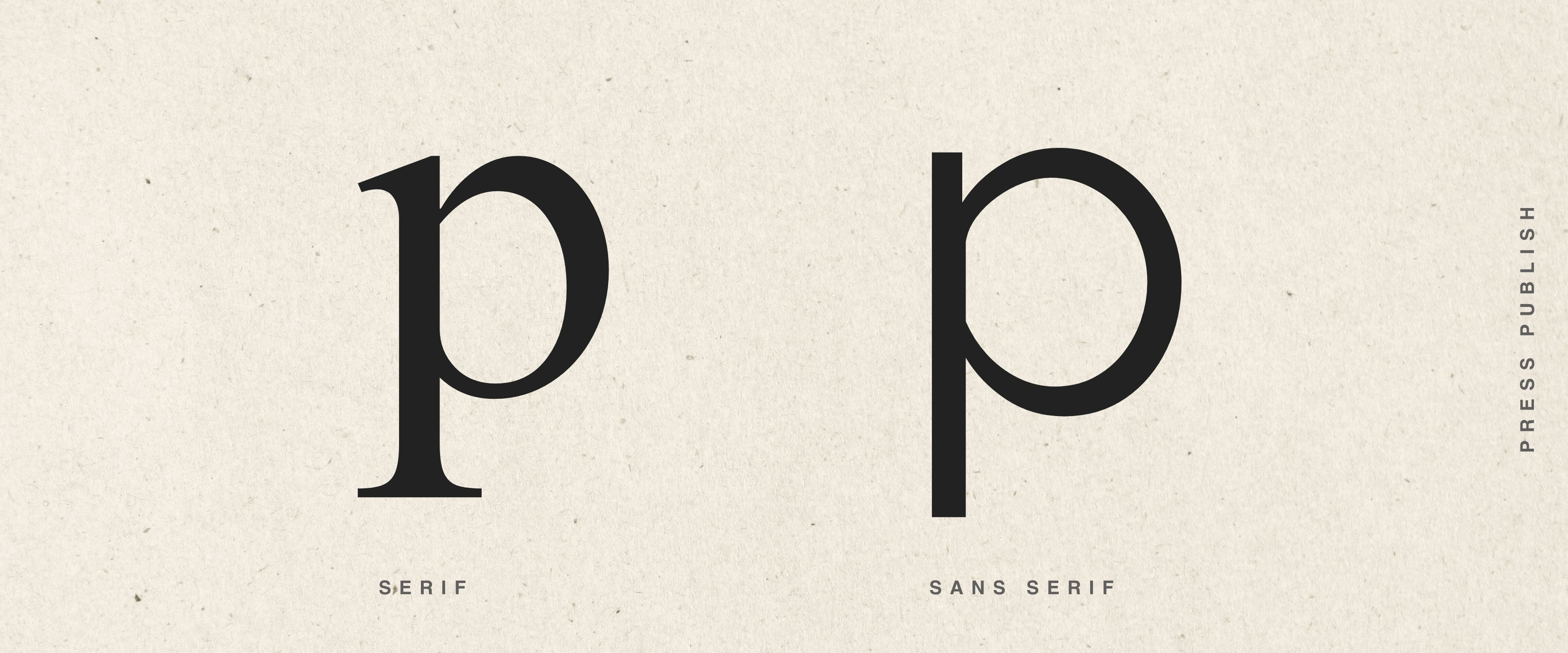
The basic font types and what they say
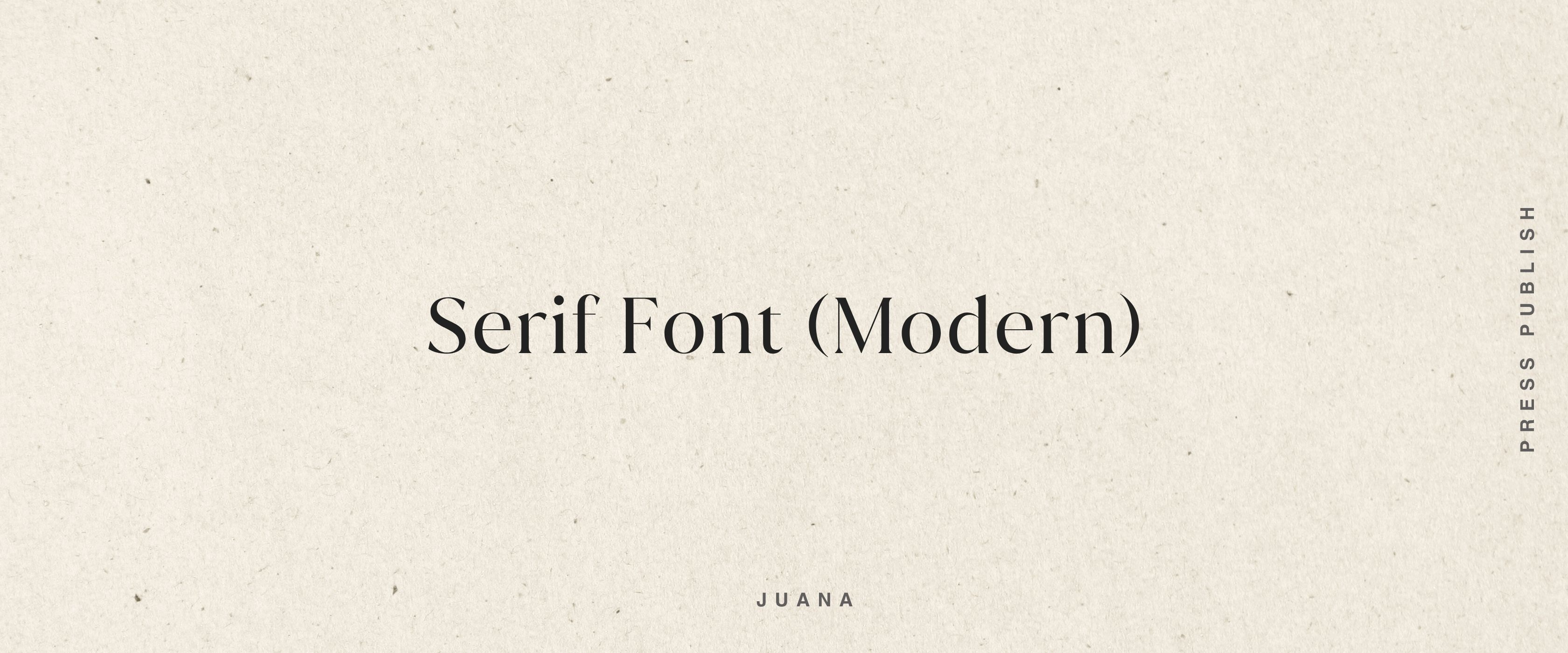
Serif fonts — these have the small decorative strokes at the ends of letters. Think traditional book typography and magazine print. They carry weight, substance, history. They can feel editorial, intelligent, trustworthy, established, considered, elegant. A beautiful serif says: this has roots. This means something.
BUT, the wrong serif can feel: Stuffy, conservative, rigid, traditional to a fault, “old world,” heavy.
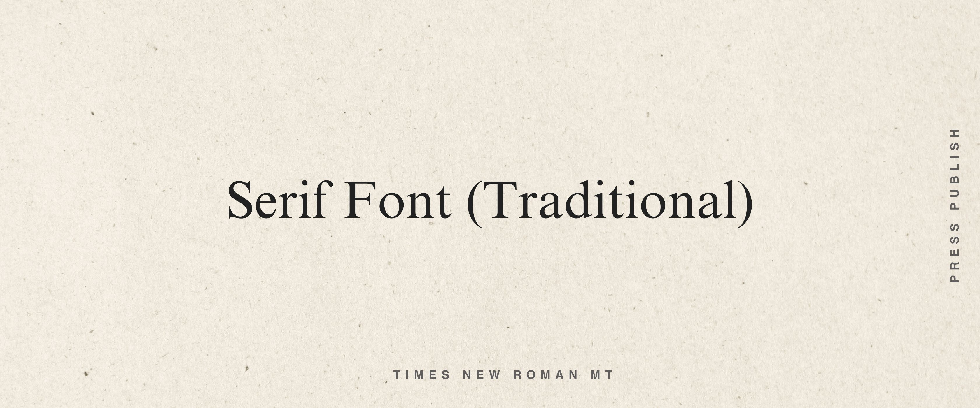
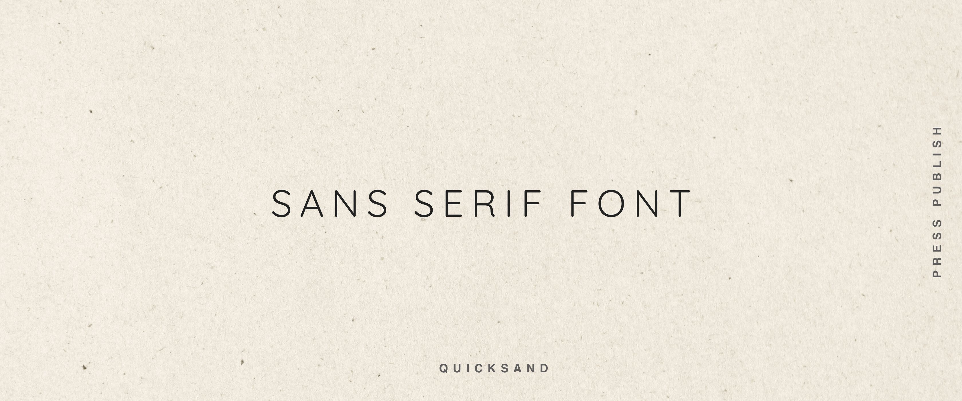
Sans-serif fonts — clean, no decorative strokes, contemporary. They feel modern, clear, accessible, simple, calm, direct. A well-chosen sans-serif says: this is now. This is easy to be with. BUT the wrong sans serifs can feel: cold, generic, corporate, flat, lacking personality.
Script fonts — flowing, handwritten-style. They feel personal, expressive, artistic, feminine, intimate. In the right context, a script font feels like a signature and like something only you could have written. BUT the wrong sans serifs can feel: Overly decorative, girl-boss circa 2010, hard to read, try-hard, cliché, lacking substance. On their own they can tip into feeling ungrounded or decorative so balancing with other font types is often key.
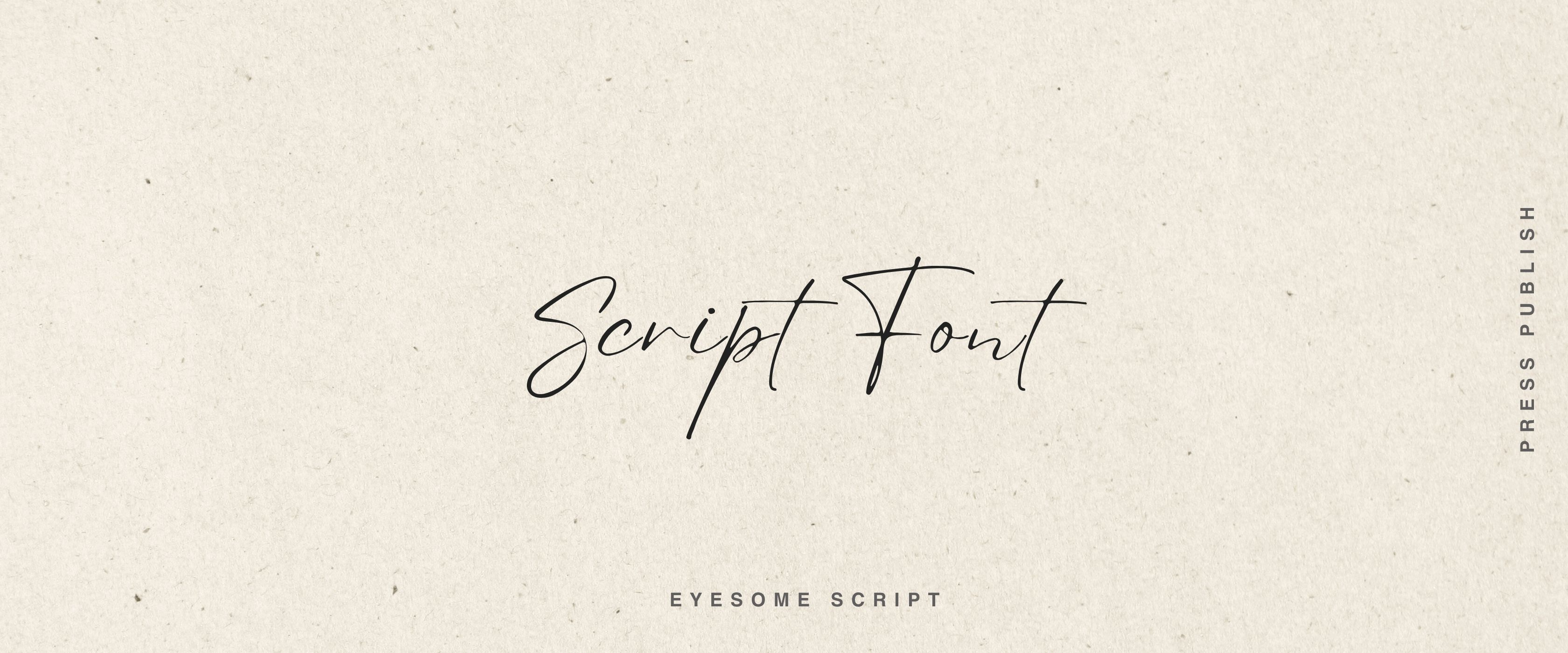
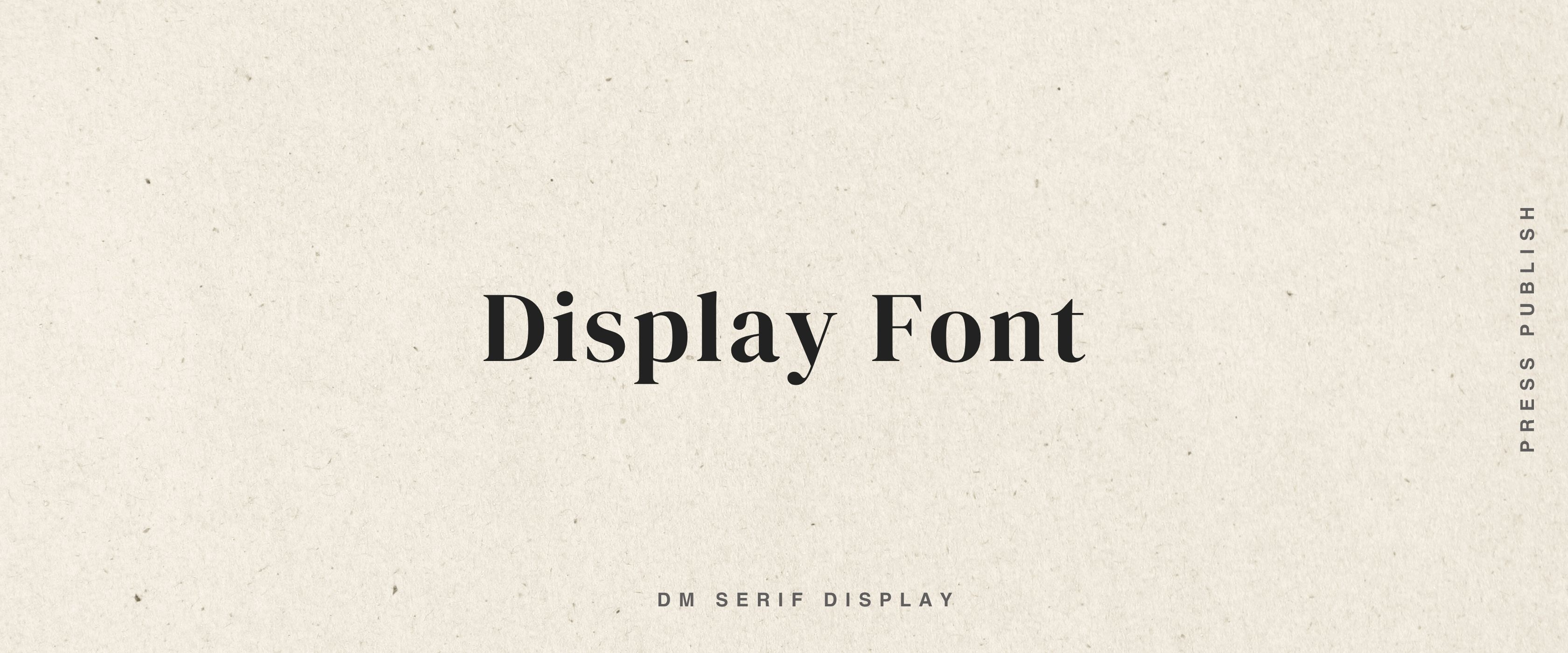
Display fonts — these are the characters. The ones with a strong point of view. They might be geometric, or architectural, or have an era written all over them. Used well, they’re unforgettable. They feel: Distinctive, creative, confident, full of personality, expressive. BUT, can also feel: Overpowering, chaotic, gimmicky, style over substance, tiring quickly. Used carelessly, they can overpower everything else.
The magic of font pairing
Here’s where it gets interesting. Because most of the time, one font alone isn’t the whole story, it’s the combination that creates the full character of your world.
Think of font pairing like a conversation between two people. You want contrast that creates harmony, not clash.
A few examples of how this works:
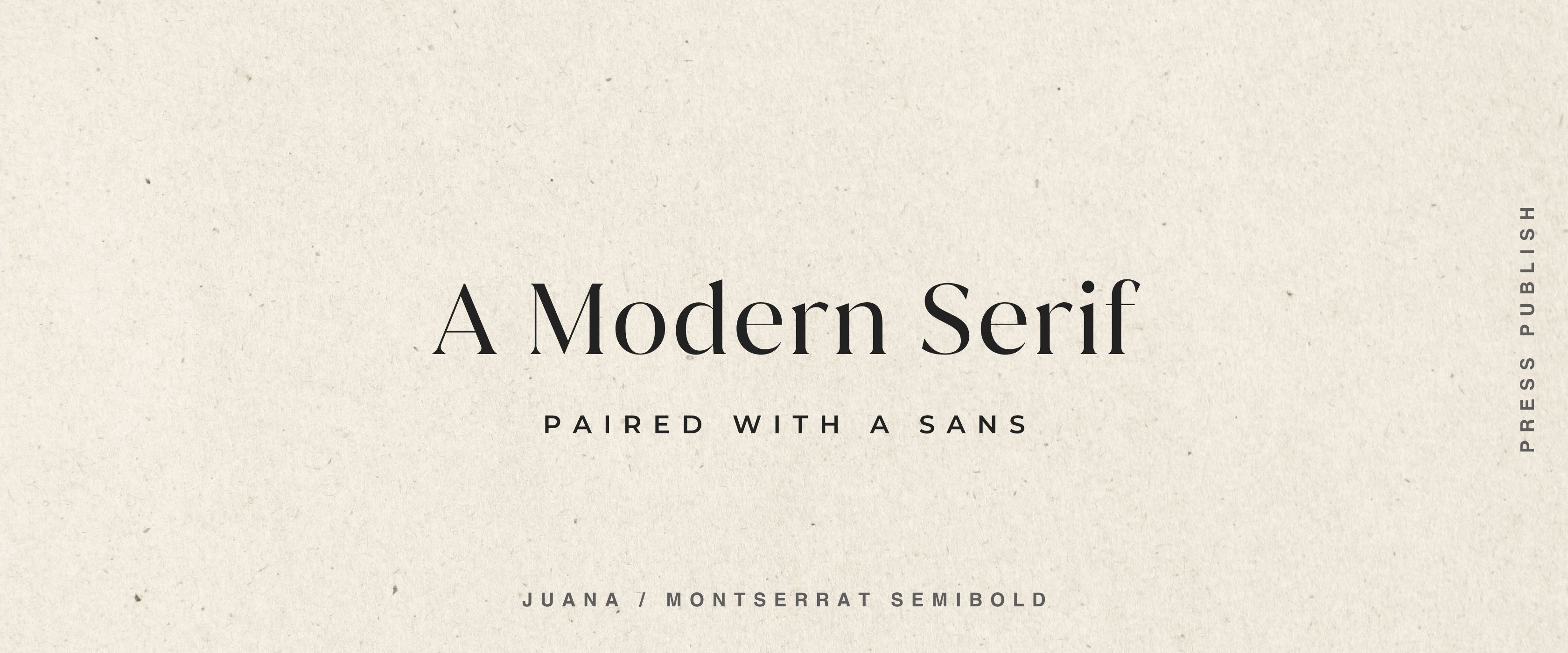
Serif + modern sans-serif — the serif brings substance and depth, the sans brings it into the present day. It feels established but not stuffy. Anchored but alive.
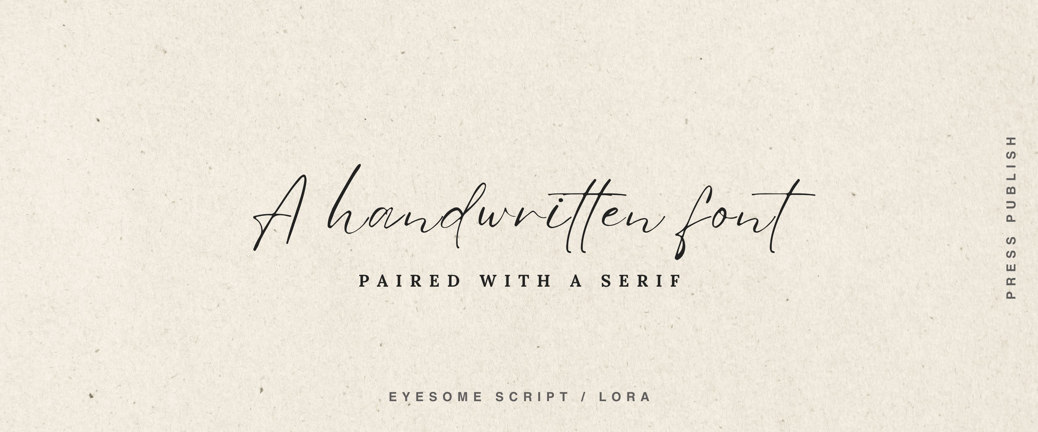
Script + grounded serif — the script brings personality and warmth, the serif anchors it with credibility. Playful, but serious about what it’s doing.
Bold display + simple sans — the display font makes a statement, the sans lets the content breathe. Strong identity, clean delivery.
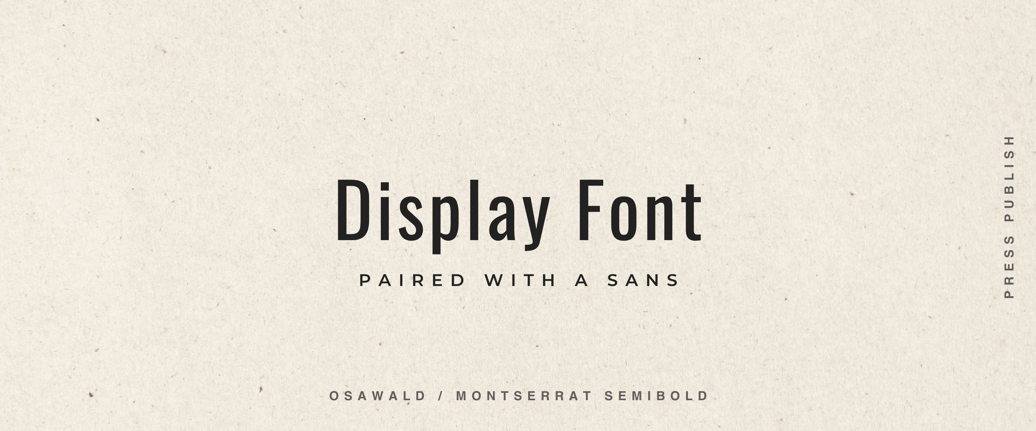
The principle is simple: let one font lead and one font support. Don’t put two strong personalities in the same room and expect them to get along.
Uppercase versus lowercase
This matters more than people think.
Uppercase tends to feel more formal, more structured, more yang — authoritative, architectural, strong.
Lowercase tends to feel more yin — warm, approachable, receptive, human.
A couple of examples:
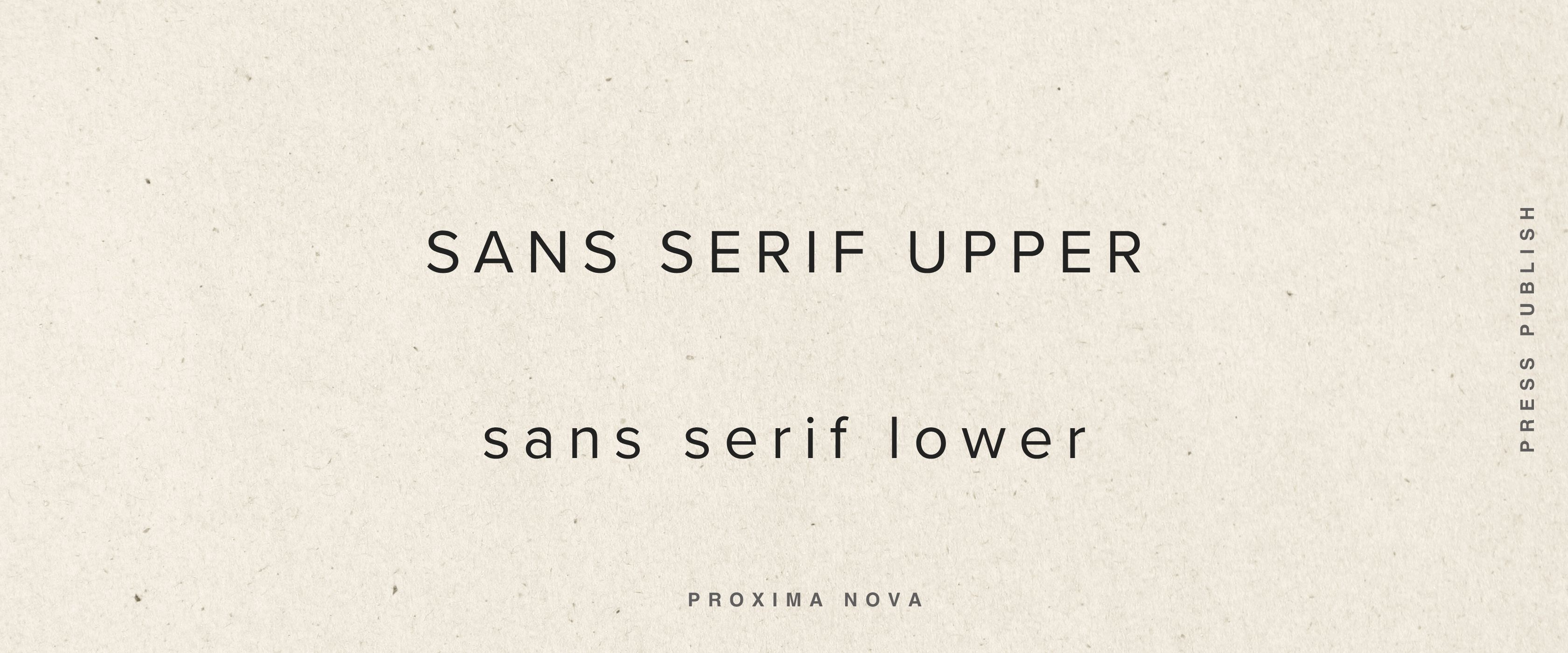
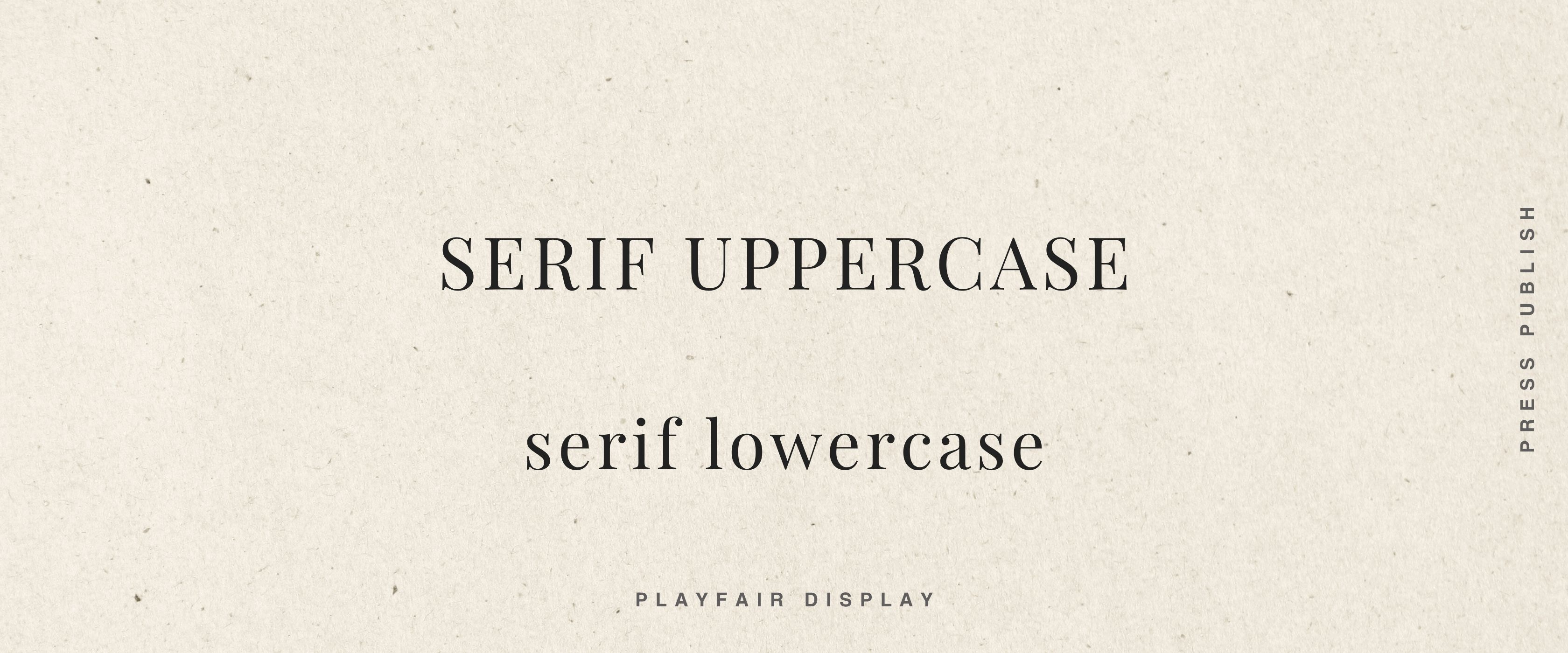
Neither is better. But one will be more you than the other. And using your logo font in all caps versus sentence case or all lowercase will create a completely different impression even with the exact same typeface.
Try both. Feel which one sits right.
About roundness and form
When looking for fonts we also want to look at the actual shape of the letters. Are the curves soft and generous? Or are the angles sharp and precise?
That form carries meaning. A font with very rounded, open letterforms feels warm, gentle, inclusive. A font with tight, structured geometry feels precise, intentional, architectural. Most fonts sit somewhere on a spectrum between those two poles.
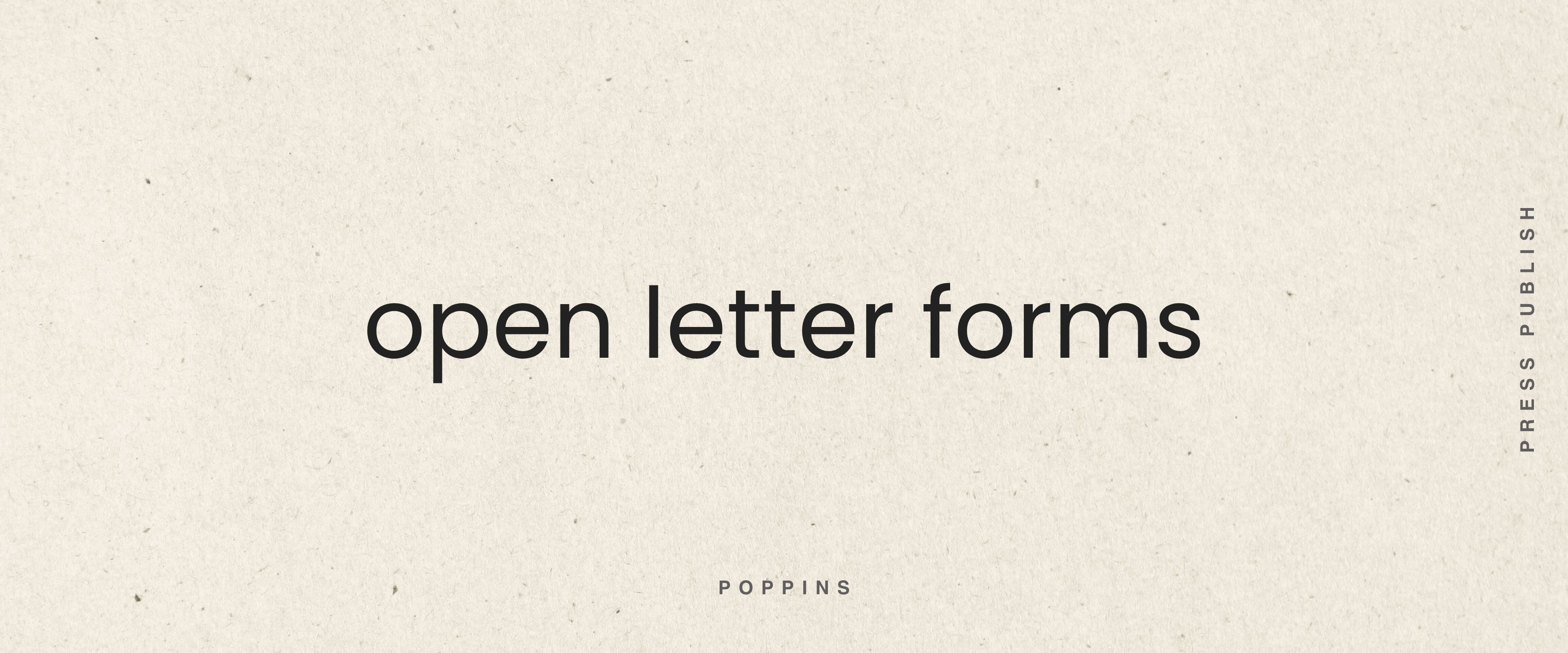
Where does your world sit? Do you want people to feel held and softened? Or activated and sharpened? Or somewhere in between - structure plus warmth?
The form of the letters can help reinforce that feeling.
Your starting point: the template
In your Substack Starter Canva template, you’ll find a curated selection of fonts — these are some of my personal favourites from what Canva offers.
As a brand designer, these are the ones I would use without hesitation for a brand logo. They’re beautiful, they’re versatile, and they’re a world away from the ones that make designers quietly wince.
Start there. Play with them. Put your publication name in a few different options. Look at them next to your mood board. Feel which ones belong in that world and which ones don’t.
If you already have a font you love and use as part of your existing brand, wonderful. Use it. Trust what you already know.
If you’re starting from scratch, here’s my advice:
Pick the one that makes you exhale slightly when you see your name in it. The one where something settles. You’ll know it when you see it, even if you can’t explain why.
Choose it. Then go and make yourself a cup of tea.
Remember, this is not forever.
Your font can change. Your brand will evolve. This is not a decision you are locked into for life, it’s a decision that gets you moving, that gives your world a visual voice for right now.
The danger is not choosing the wrong font. The danger is spending so long choosing that you never begin.
So. Find the one that feels right. Trust it. Move.
Next Up:

Just press publish.
Lucy x
Ready to go all in on Substack and looking for practical support through the entire process? CHOOSE YOUR SUBSTACK ADVENTURE HERE. Join The Studio and let’s do this together, step-by-step.
Need a little more support?
If you’d like some creative and energetic direction to help get your Substack world off the ground, I offer a Substack World Creative Direction Session for founders who want a designer’s eye on their identity decisions → Drop me a DM.
Loving the step by step @Lucy - Business of Becoming
Lucy, on the topic of fonts, can you share how you created the large, green W at the beginning of this newsletter?