

Brand theory: Adding a graphic element to your Substack logos
Adding a little touch of something to make it more uniquely yours.


What we’re doing here Deciding whether to add a graphic element to your logo. Exploring whether a small visual accent - a botanical detail, a watercolour splash, an organic mark - adds something to your wordmark, or whether clean and simple is right.
✓ Already have your logo mark decided and you’re happy with it? Move along.
✗ Not sure whether to add something or keep it simple? Read this, then browse the examples in your Substack World Starter template and see what calls to you. Play. You don’t have to decide today.
You’ll need: your Substack World Starter template in Canva. A cup of tea.
Before we start, I just want to say that you don’t have to do this step.
A beautifully chosen wordmark - just your publication name, in the right font, in the right colour - is a completely legitimate logo. Many of the most distinctive publications out there are nothing more than that. Clean, considered, done.
But.
If you want to add a little something, then a small graphic element that gives your logo a touch more personality, a little more distinction, something that makes it feel just slightly more made - this is where we explore that.
What we’re actually talking about here
Not a complicated brand concept. Not a custom illustration that costs a fortune and takes six weeks. Just a little touch. A small visual accent that sits alongside your wordmark, cover and publication icon to add a layer of feeling.
Something that may carry a loose connection to what you do, or might simply feel like you, or like it belongs in the world you’re building, without needing to explain itself.
What counts as a graphical accent?
Lines (dividers, underlines, frames)
Shapes (blocks, circles, organic blobs)
Icons or symbols
Arrows, marks, highlights
Subtle textures, patterns or illustrations
They’re not the main event, they’re supporting energy. Think about things like:
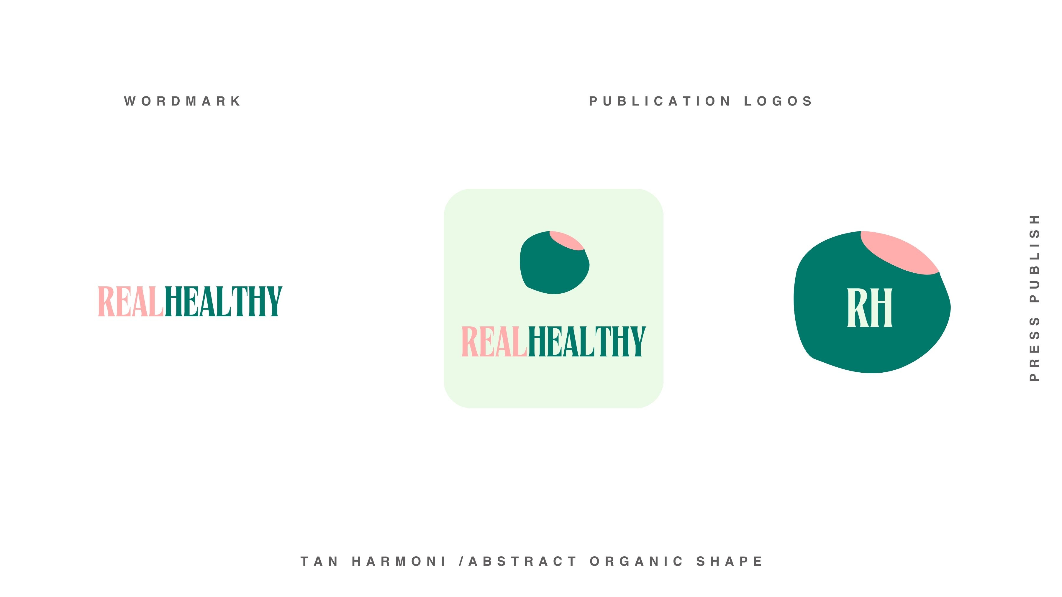
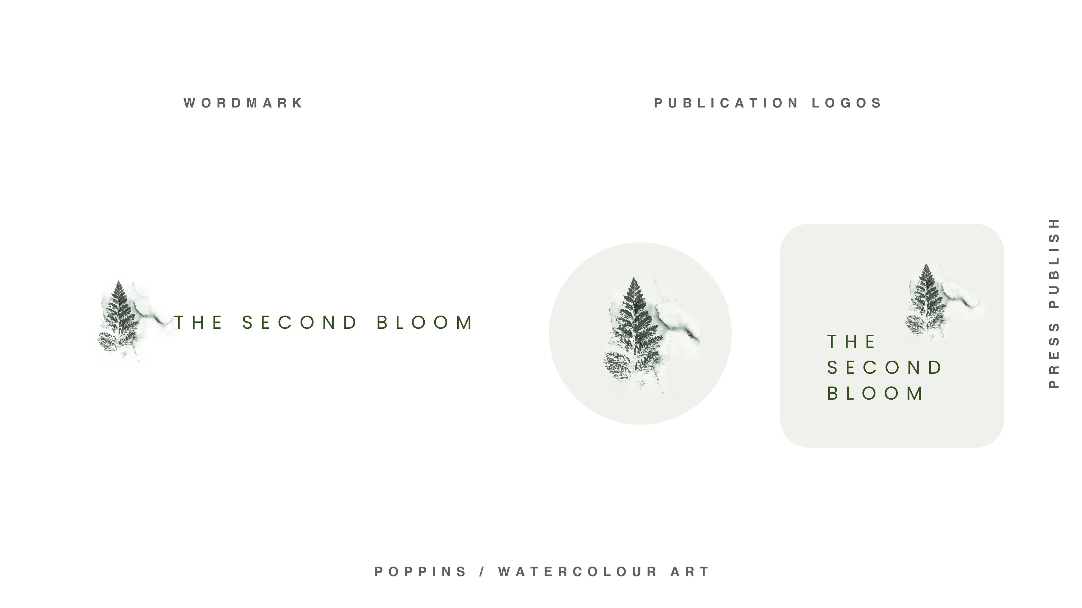
Watercolour splashes and smudges. Organic shape forms. Botanical details and shadows. Hand-drawn scribbles and doodles. Little splatters. Gold accents. Soft gradients. Organic lines. Vintage illustrative elements. Small postcard-style marks.
Nothing heavy. Nothing that competes with your name. Just a touch.
Things to think about when choosing a graphical accent
Let them echo your brand feeling
Grounded, calm, spacious → thin lines, lots of breathing room
Bold, opinionated → strong underlines, blocks, high contrast, chunky marks
Soft, feminine → curves, light strokes, subtle movement, undulating
Clean, editorial → straight lines, grids, minimal rules, space
Organic → imperfect lines, gentle curves, handmade
Personal, warm → handwritten marks or notes, loose underlines, doodles, subtle “imperfections”
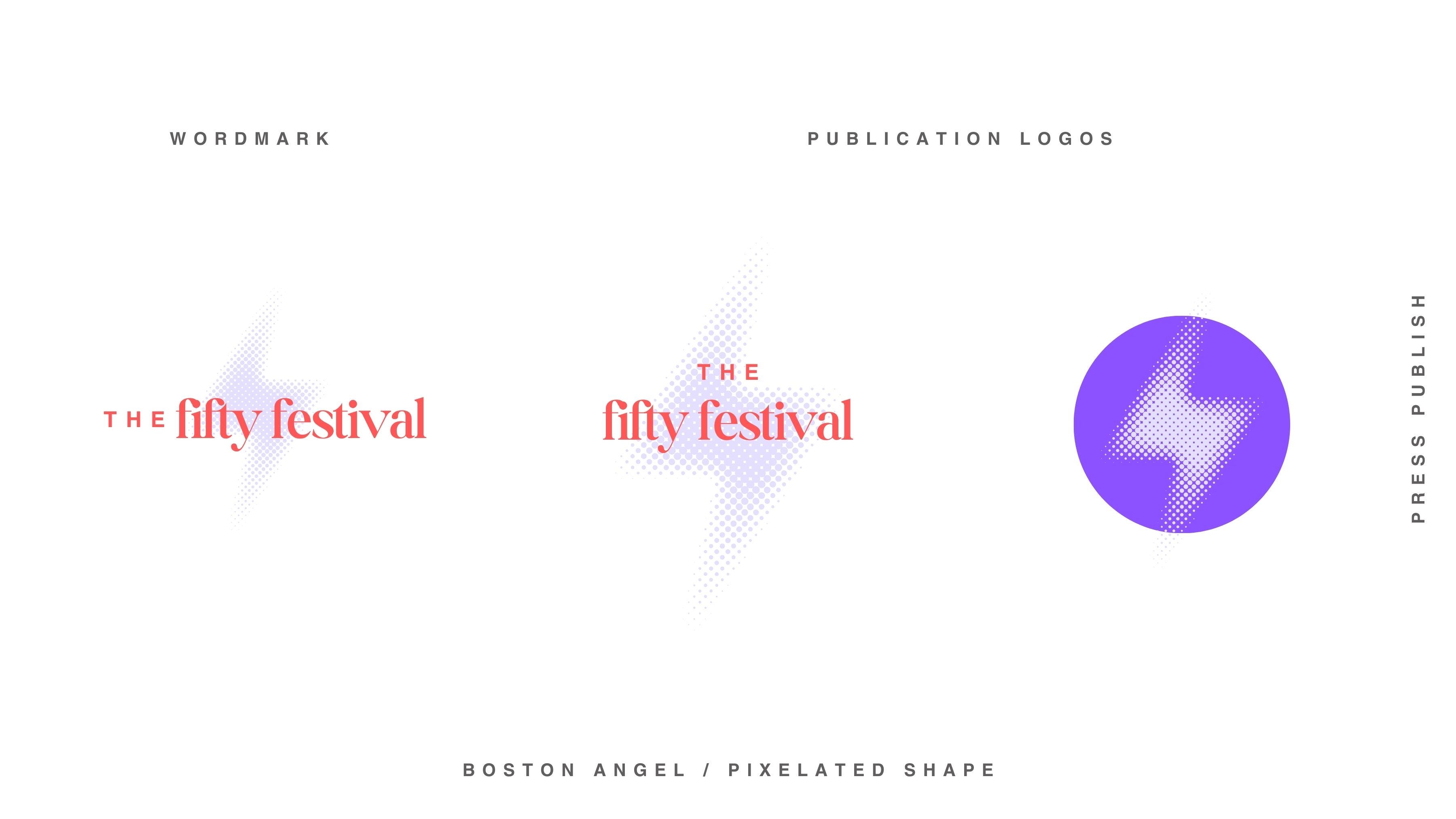
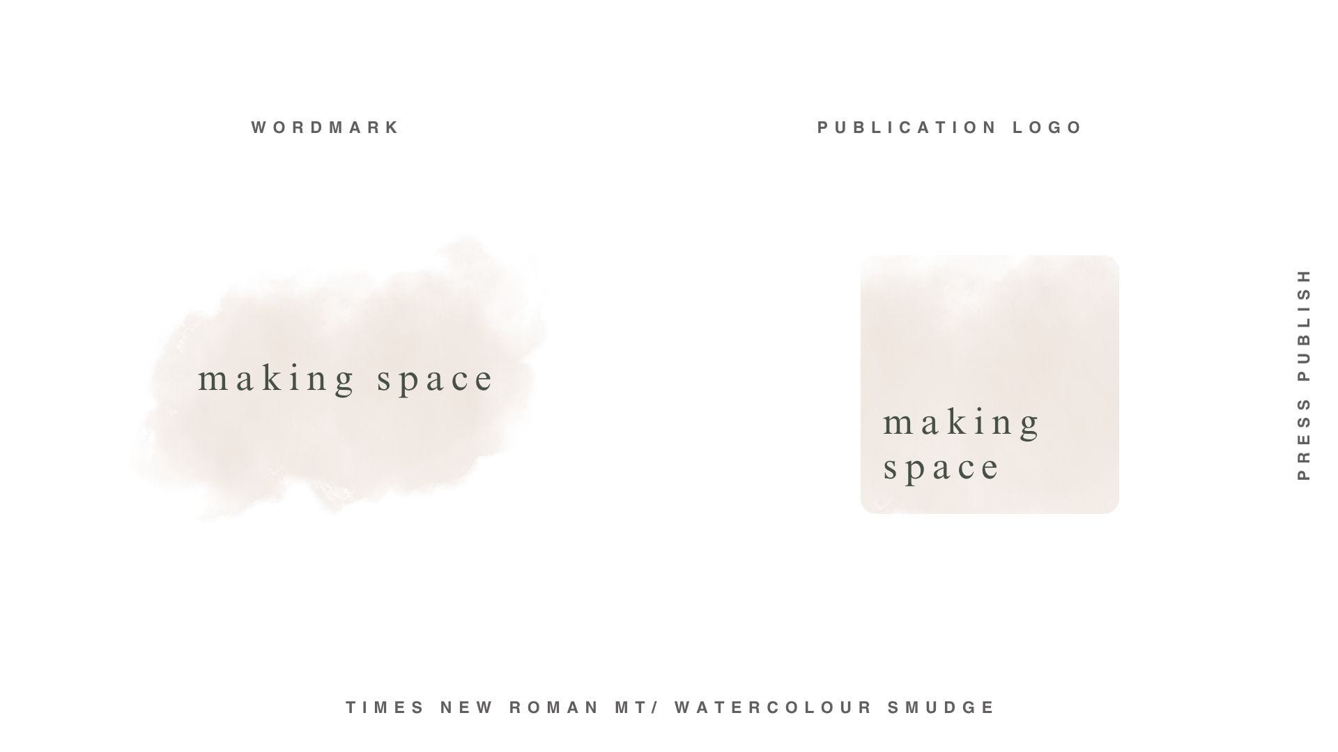
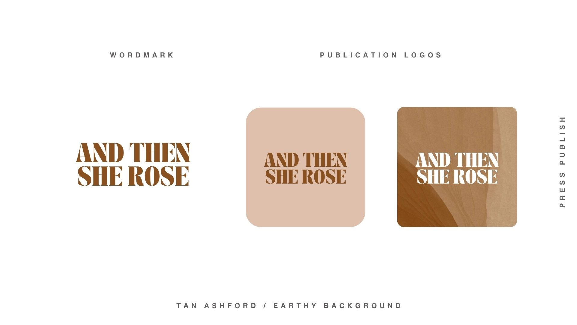
Example mock-ups to up to get your creative juices flowing
Graphical pops have the ability to take your font and colour-based logos into something that feels like more of a cohesive brand.
These are just a few examples. You’ll find lots of options to spark inspiration in your Substack World Brand Foundations Toolkit, and I’ll be creating more mockups soon (some that you can even take as your own and run with).
How to explore this in your template
In your Substack World Brand Foundations Toolkit template in Canva, you’ll find around 45 different graphic element examples to explore. Not finished logos, but starting points. Visual prompts with different vibes. Things to spark something.
Scroll through them. Don’t analyse. Just notice what you’re drawn to. If something makes you feel “oh, that has something”, stop there.
Then here’s a little Canva trick worth knowing:
Click the three dots next to any element you like and go to → Info → See more like this
Canva will show you a whole world of similar options. Change the colours. Resize it. Combine it with your font. Play. Have fun!
Once you’ve found something that feels like it belongs, bring it into the mock-up pages alongside your logo font and your colour palette. See how it all sits together. See if it still feels right when it’s all in the same room.
Sometimes it will. Sometimes you’ll realise the wordmark alone was always the answer.
The only question that matters
Does it feel like you?
Not is it perfect. Not will everyone love it. Not is it professional enough.
Does it feel like a small, true piece of the world you’re building?
If yes, use it. If not, leave it.
Your wordmark is waiting and it doesn’t need anything added to be enough. 🌿
A word on keeping this in perspective
If you’re building a business out in the wider world — thinking about trademarking, creating brand assets that need to hold up across all kinds of contexts — then yes, working with a designer to create something original from scratch is the right move.
But if you’re here to build momentum on Substack, to create familiarity and recognisability with your growing community? Canva is completely fine. It’s a brilliant sandpit for exactly this, and what you create here can absolutely become the visual shorthand your people know you by. Don’t let perfect be the enemy of published.
Next Up:

Just Press Publish.
Lucy x

A little about me
Hi, I’m Lucy. I spent twenty years in corporate before walking away to build work that was actually mine. What I discovered on the other side — about energy, alignment, and what it means to express yourself honestly in business — is everything I teach from now.
I’m a brand, web and messaging designer working at the intersection of identity, brand energetics, and soulful expression - helping founders build a presence that feels as true on the outside as it does on the inside → Fresh Leaf Creative
Press Publish is the rolled-up-sleeves, hair-in-a-topknot version of its sister publication The Business of Becoming — where you’ll find musings on creative expression, anti-hustle marketing, building a sustainable brand ecosystem, and returning to your natural rhythms → The Business of Becoming
Need a little more support?
If you’d like some creative and energetic direction to help get your Substack world off the ground, I offer a Substack World Creative Direction Session for founders who want a designer’s eye on their identity decisions → Drop me a DM.